The Facebook image of the world is not real. The physical world with continents, coastlines, islands and rivers has been with us for longer than we can remember. We even have it rendered on maps, be it on paper or digitised versions. The spread of social media and Facebook in particular is now challenging the way we see the world.
Oceans and mountains are no longer obstacles to be overcome by some adventurous expedition or a faster ship, and political barriers are no real barriers. Uncharted territories simply don’t exist on the new world maps. All our differences are being eradicated.
Or may be not
The sales pitch has been all over the (Western) world since around 2005. We are connecting across physical, lingual and political divisions, we are finding new friends in other countries and keeping up with old friends when they move permanently or temporarily to other places. First truth: The pace in which this digital revolution is happening, is tremendous. Second truth: It is a revolution. Third truth: It has a potential for being dangerous to some, an opportunity to others.
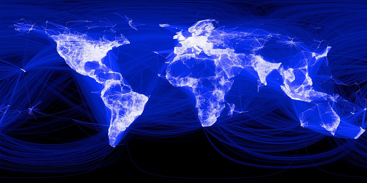
The Facebook world of friendly connections was first presented in a Facebook blog post in 2010 based on the acquiring of data, first from a sample of 10 million users, then Facebook’s entire 500 million user accounts.
The intern who did the maths and wrote the story observed that “the lines didn’t represent coasts or rivers or political borders, but real human relationships. Each line might represent a friendship made while travelling, a family member abroad, or an old college friend pulled away by the various forces of life. (…) When I shared the image with others within Facebook, it resonated with many people. It’s not just a pretty picture, it’s a reaffirmation of the impact we have in connecting people, even across oceans and borders.”
The heat map of 2010
This is how the December 2010 map looked like, just a few years after the public launch of Facebook as a worldwide social media platform. It looks like an artwork, doesn’t it? There are no physical borders, only rays of light. Could it be that John Lennon’s hymn “Imagine” had actually been realised, with the help of Facebook?
The heat map of 2013
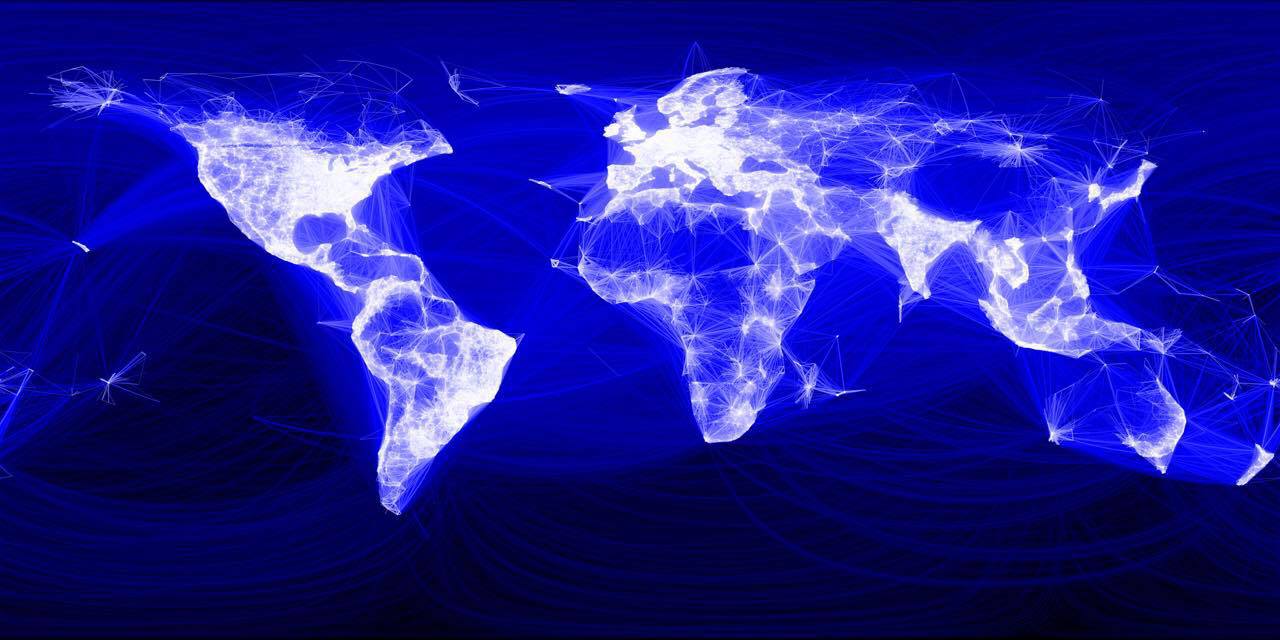
Facebook continued to evolve in terms of number of users and connections. In September 2013 they made another map, seemingly using the same methods but now with a considerably larger user base – 1.1 billion. In the picture below you will notice that more light rays has spread across the world, more densely and to slightly more places. The picture is not really very different from 2010.
Notice the difference?
Now, take another look. Click on the image to enlarge and study it for a few seconds. Did you notice that there is no China and that North Korea has been completely wiped off the world map? Russia, the world’s largest country in terms of area has been almost eradicated too. North America and Europe are in contrast the homes of “enlightenment”, the places where there is light and from where all light is radiating. There is something almost religious about this map.
The heat map of 2017
Finally in June 2017 Mark Zuckerburg, the founder of Facebook, proudly presented the third heatmap on his own Facebook page. “Updated with 2 billion people. The world is a little brighter now.” 2 billion is truly an amazing number considering we only are 7.5 billion humans on this planet ranging from the newborn to the 100+ years old. But brighter?
Evaluation
The apparent insight these maps put together gives us, is that of stability. The Western world is getting more densely covered by white rays, indicating that more users have signed up and got connected in areas where Facebook already had a solid presence only a few years after its launch. In other countries, and especially in Russia and China, there has been very little “enlightenment” going on during these years. These countries have not been particularly interested in investing time and membership in a social network, “Made in America”. Users have in various ways been dissuaded from using Facebook, but Russia and some of its former allies, and China, have more importantly promoted popular alternative social networks to Facebook.
A heatmap of what?
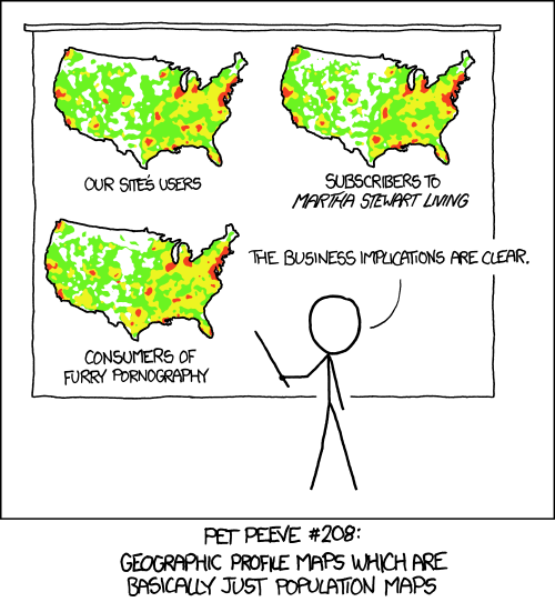
One observer notes that “with the exception of these gaps, the map is more or less a heatmap of human population density or at least internet connected population density”. What does he mean? Have a look at this cartoon first.

A Heatmap explained. Are connections for real or is there something behind that explains everything? (Source: xkcd.com)
What is the implication of this?
It means that ice cold water seawater is being trickled on Facebook’s threefold heatmaps, the Facebook image of the world. The dense white rays giving us the shapes of Europe, North America, the coasts of South America and Australia merely represent a large number of people living there. They are on the internet, and some of them have a more or less active Facebook account. And so what? They are also on Instagram and Snapchat, and they have a Gmail account. I wouldn’t be surprised if connection maps from those service providers would produce the same results as Facebook’s. For instance, have a look at these examples: Exhibit A, Exhibit B, Exhibit C, Exhibit D.
I would rather much more like to see two other heatmaps than the Facebook image of the world. It want to how real connections take place, in movements, across geographies and in time. I’m talking about migration and tourism.


